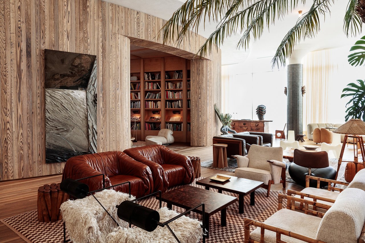
I love a designer who evolves. Case in point: Kelly Wearstler. Back in my 20’s I adored her next-level Hollywood Regency sensibilities. And now, at the end of my 30’s, I’m still in awe of her style. But this version of Kelly might be my very favorite yet.
If I had to describe the interior of the Santa Monica Proper Hotel, I’d call it LA Luxe meets Beachy Organic – two of my favorite genres, wrapped into one. If I dabbled in maximalist design behavior, I’m 100% sure this would be the inspiration for my home. I seriously can’t wait to book my next trip to LA, just to see it in person!
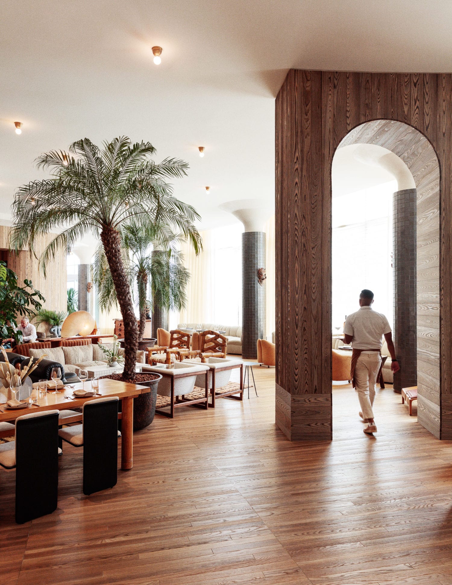

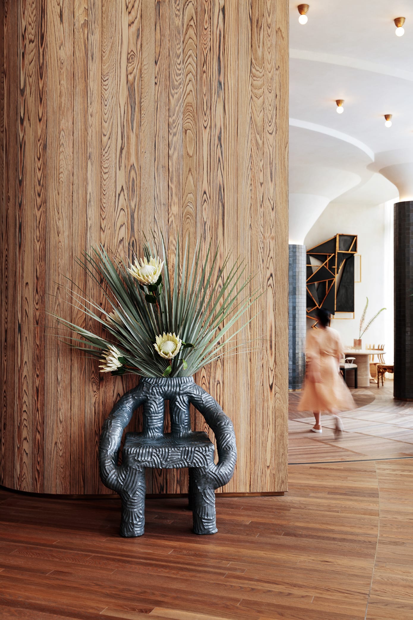
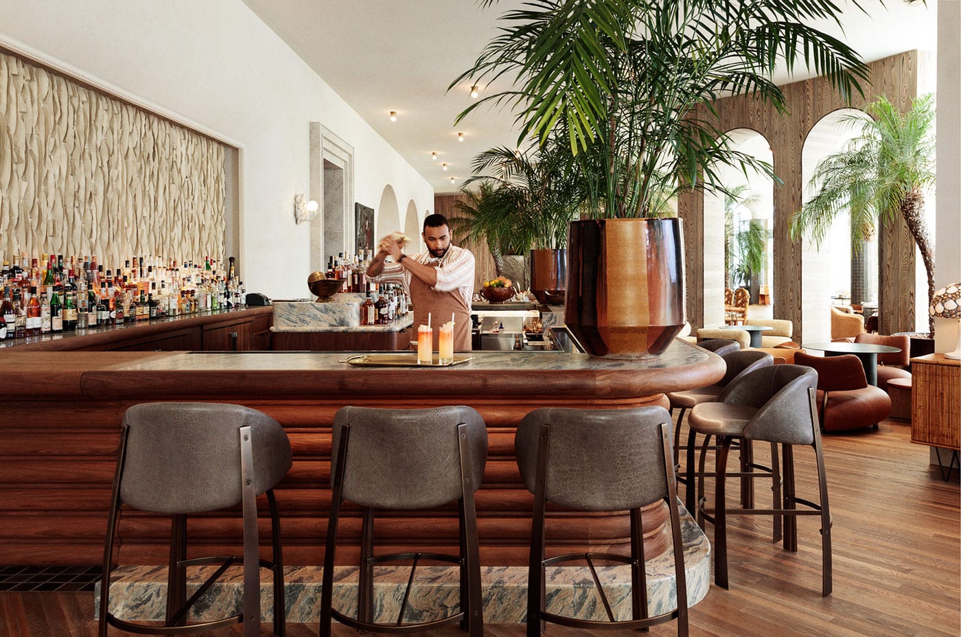
While I usually judge a hotel by their rooms (it’s easy to splurge on a lobby and skimp on a room), in this case, I have to say it’s the lobby and restaurant that really won me over. The layer upon layer of warm, organic tones and textures is so incredibly appealing! And for someone who wishes she could own this many gorgeous statement chairs, this is actually heaven.
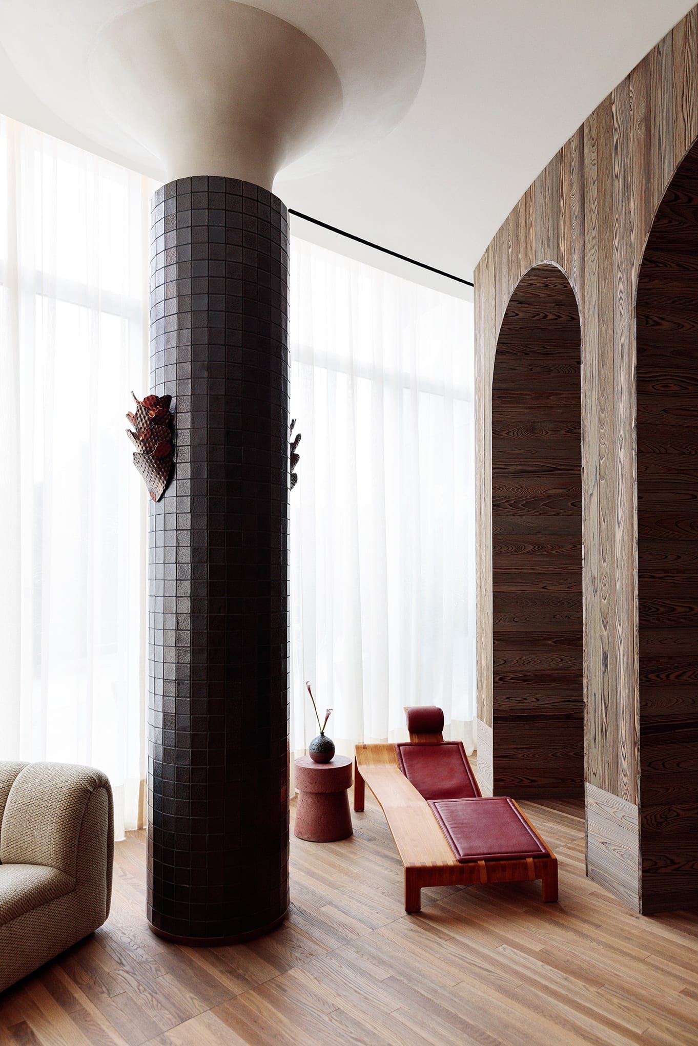

One of my favorite features are the brass sconces on the tiled pillars. It seems nearly impossible to have a hotel in California without some nod to mid-century style, but Wearstler does this oh so well. This detail feels brutalist-inspired, and I’m into it. I also love the curved banquettes and the fabric choices. Somehow addition of tropical to this luxurious mix works here. Sort of how a Panama hat captures chic and casual in the same breath.
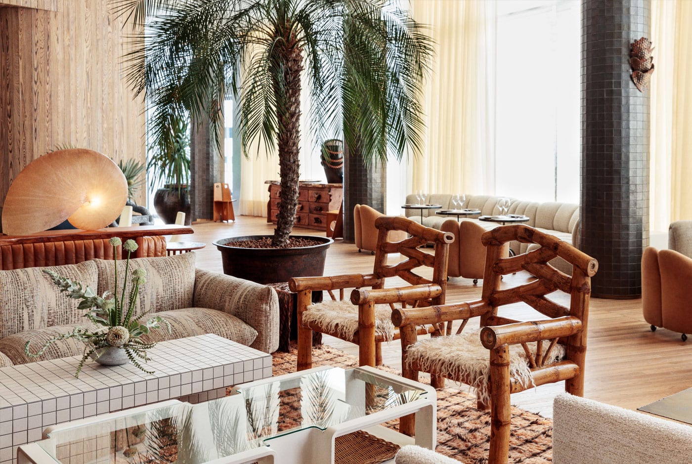
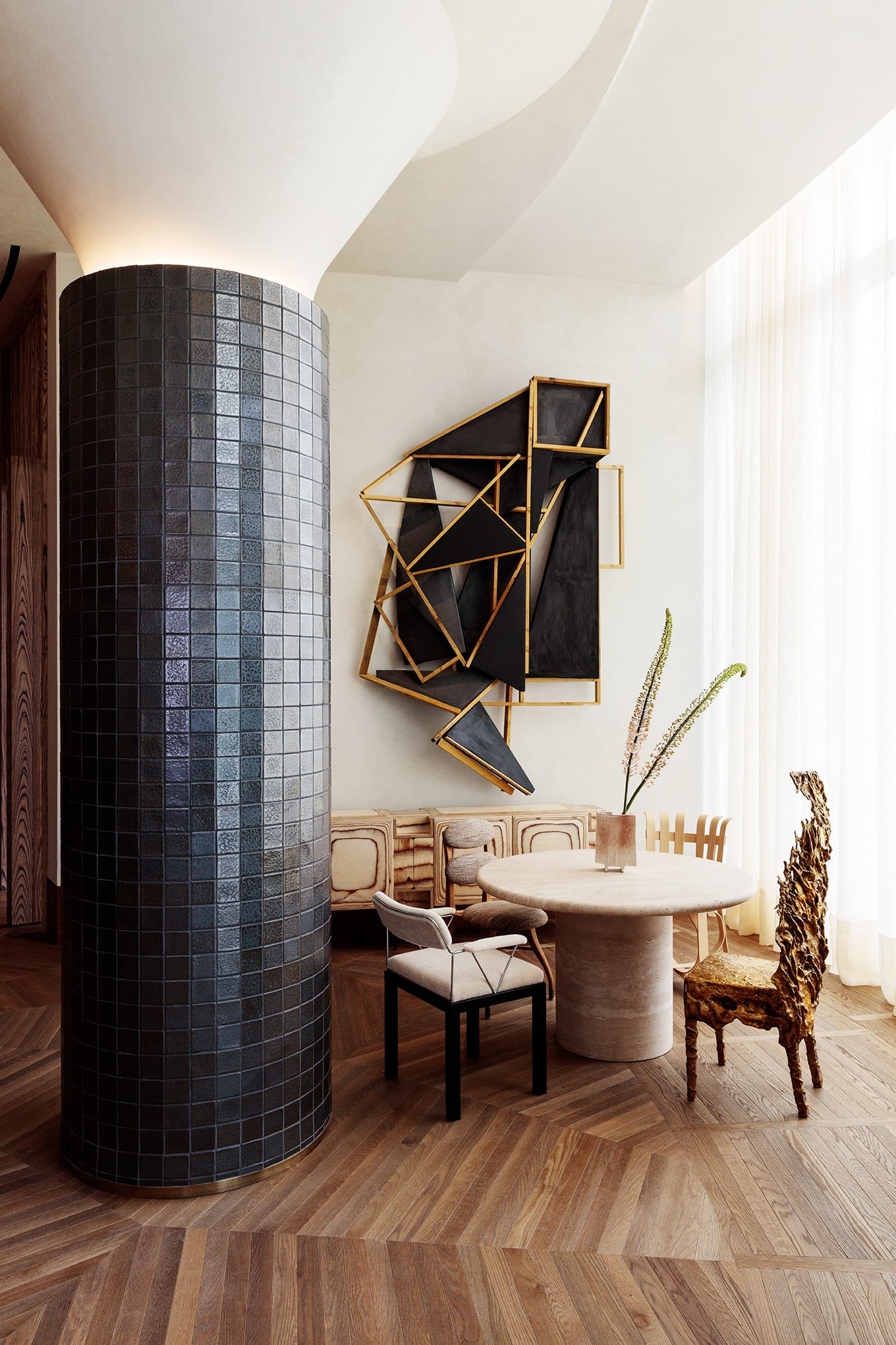
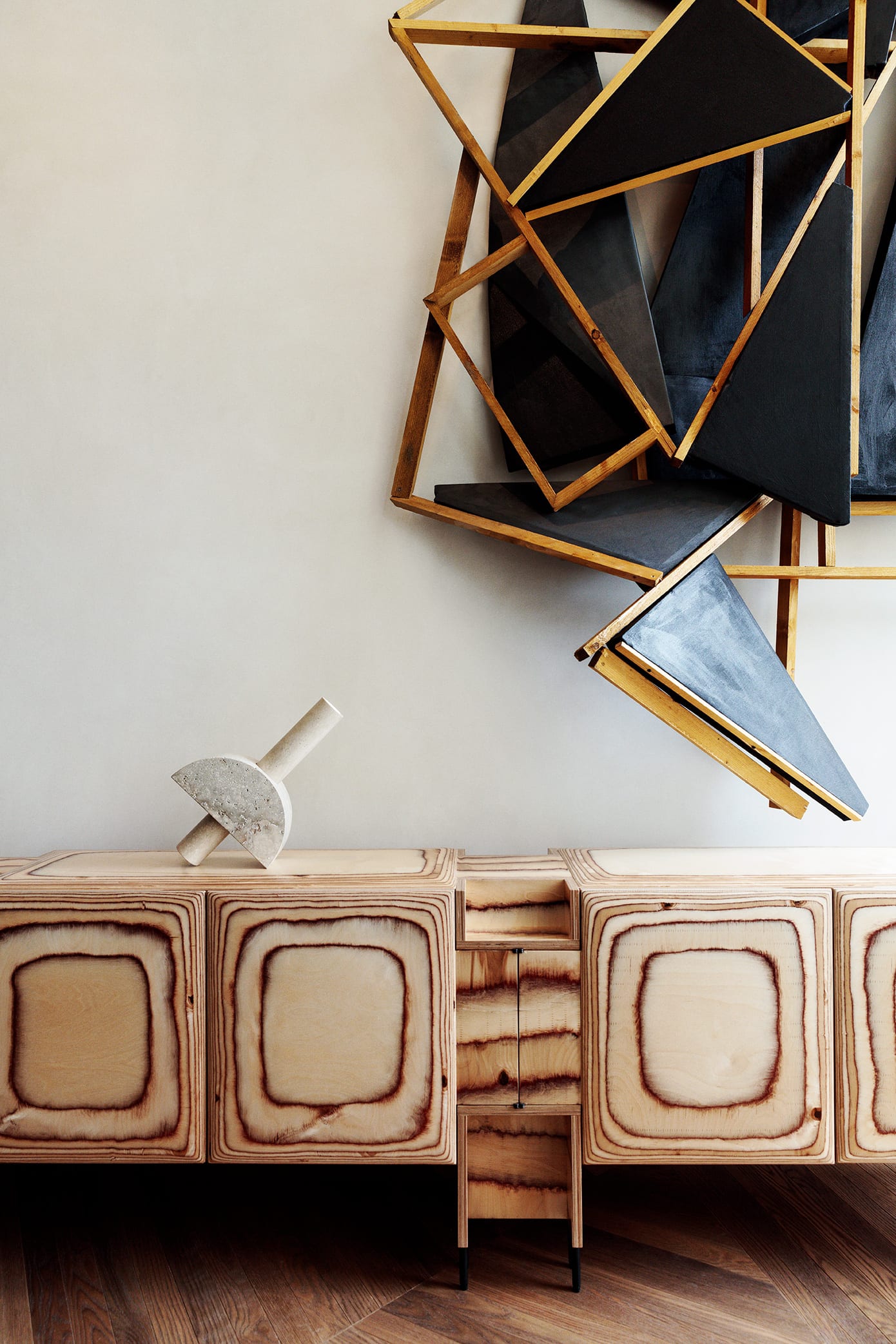
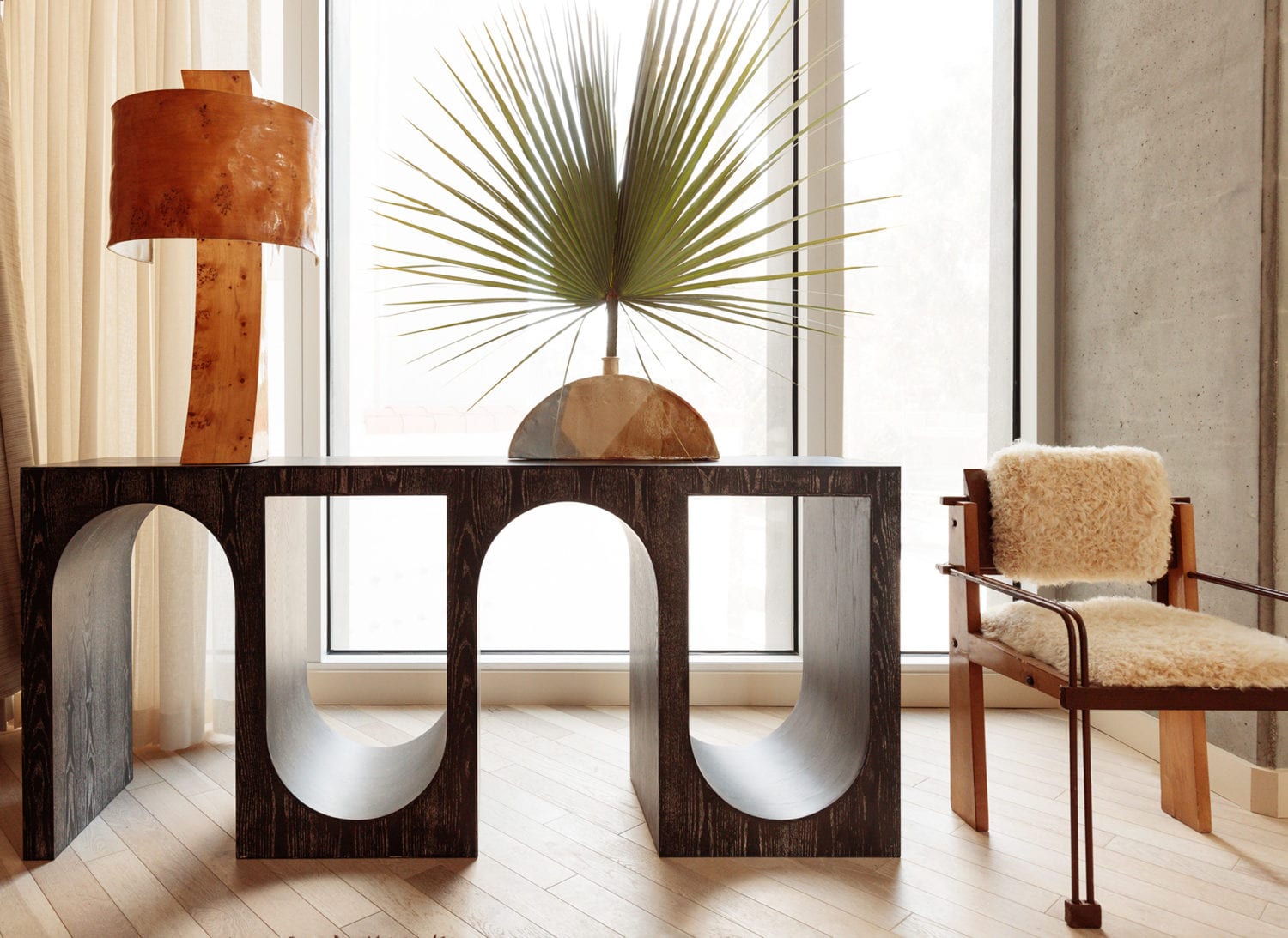
In true Wearstler style, there are definitely moments of DESIGN. Like this corner where absolutely nothing is practical, and everything is gorgeous. I’m especially infatuated with that console. This is what hotels are for, in my opinion. Stretching the limits of design, allowing you to enjoy a space that you would not otherwise be able to afford nor – let’s be honest – live in on a daily basis. In no way do I want this moment in my house, but man do I appreciate and want it in my life for a weekend.
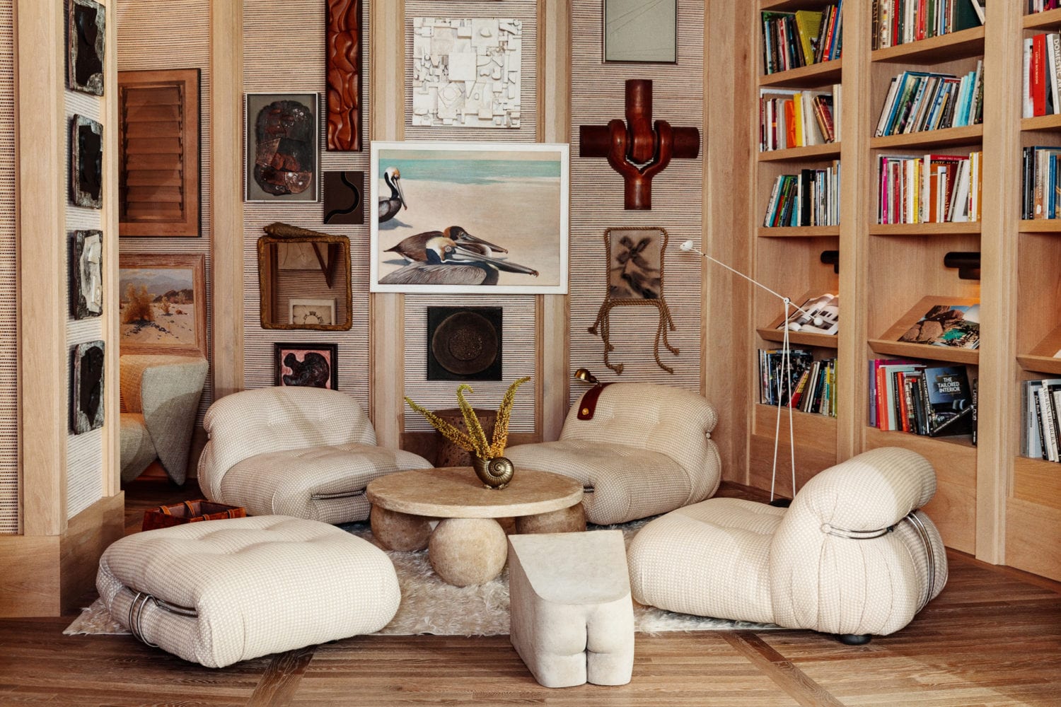
There are also other more ‘liveable’ moments like this cozy lounge area, and of course the bedrooms…
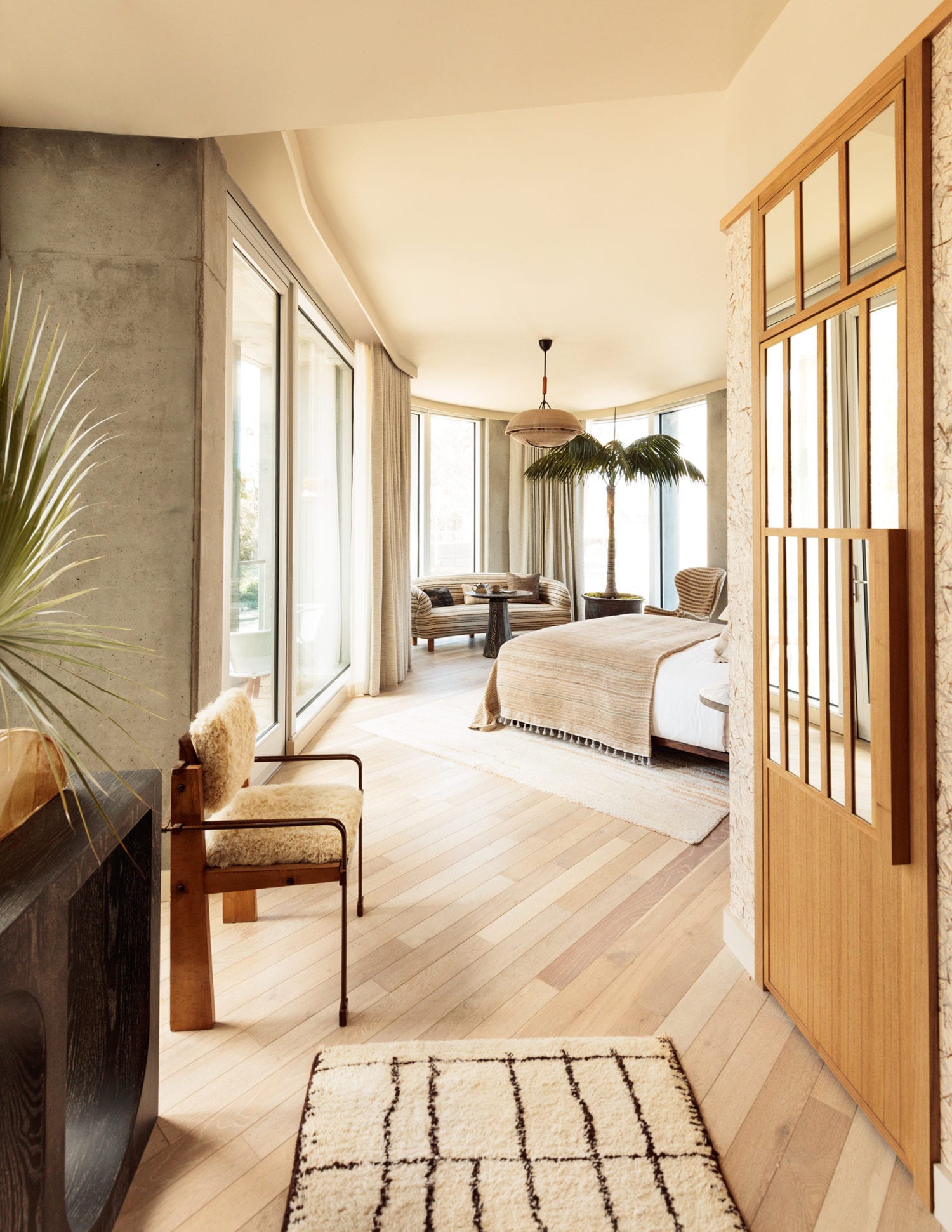
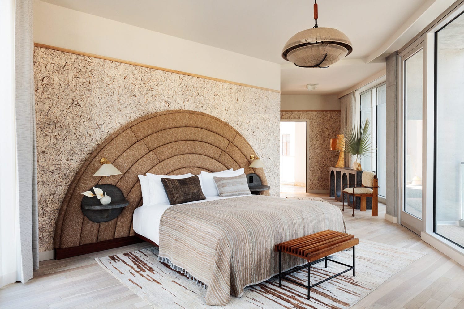
The theme of warm textures continues right into the upstairs rooms, and I appreciate the continuity of this look. Apparently, the hotel trend of built-in nightstands and chunky upholstered headboards continues to be the thing to do these days. While we’ve seen it in mostly European hotels (especially Paris and London), I suppose it’s about time that it’s brough stateside in a way that does the look justice. I do wonder about the longevity of some of these styles, but I suppose that’s not the point when it’s a Wearstler designed hotel. Sidenote, I would stuff that blanket into my suitcase in a heartbeat. Better not let me rent this room.
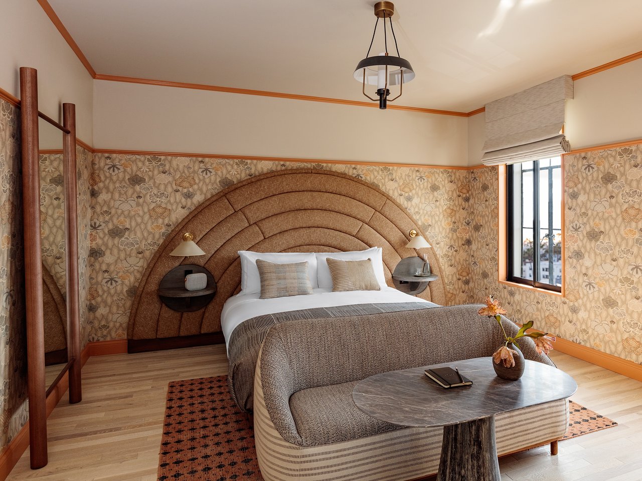
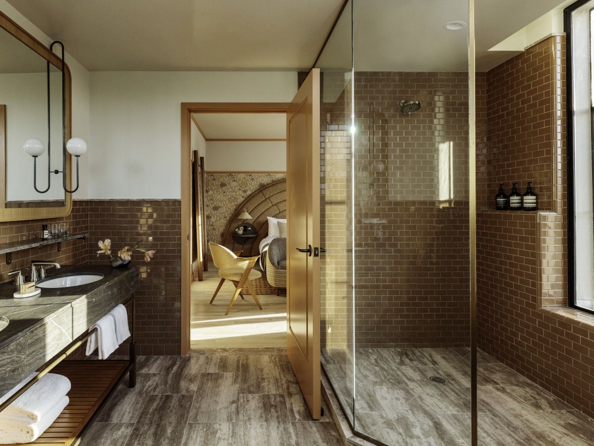
Of course, all the rooms have different styles and amenities to offer. I happen to be a big fan of this bathroom in a rust-burgundy tone, as I’m currently having a total love affair with this color. But, I think the Deluxe King set up might be my fave…
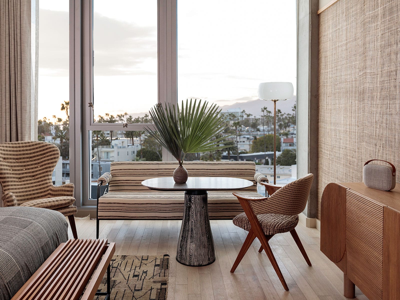
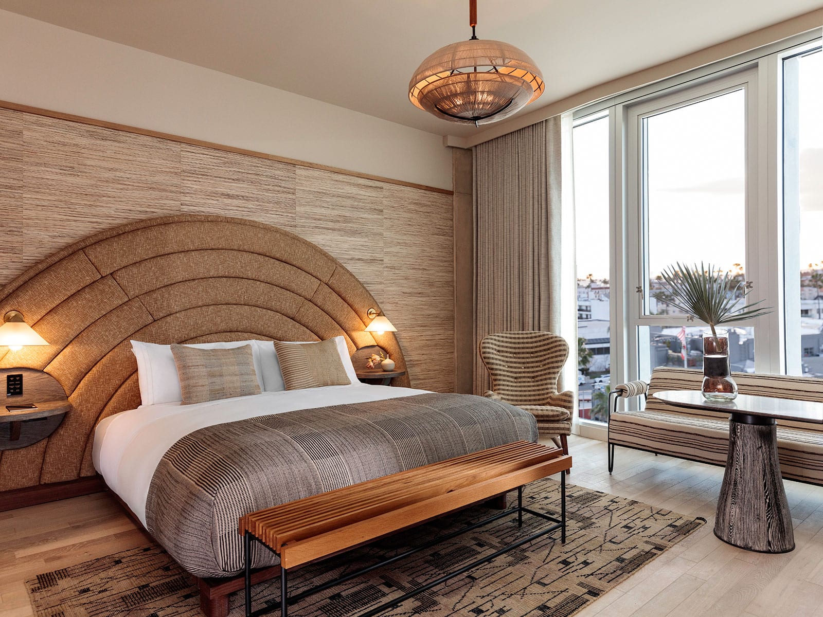
Quick venting moment here: I seriously don’t understand why people still insist on taking photos with the lights on in rooms. Anyone else find it insanely distracting? There’s obviously ample light in here!! But I digress.
I love the bench and table set up in here that allows for a little room service and work time. I’m definitely one of those people on work trips who enjoys actually using the rooms I’m staying in. Give me a bathrobe, breakfast and my laptop for the morning, and I’m happy! I mean, if you’re paying that much for a gorgeous room, you should be utilizing it – right??
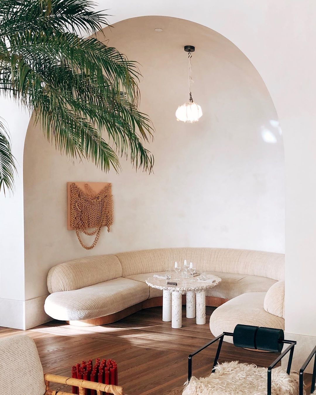
Unless, of course, yout want to meet me in this cozy nook for a cocktail… I’ll have it reserved.
The post Wanderlust Design :: The Santa Monica Proper Hotel appeared first on Cassandra LaValle.